

Sector: Life Sciences
Exploring Carrot’s Creative and Linguistic Transformation
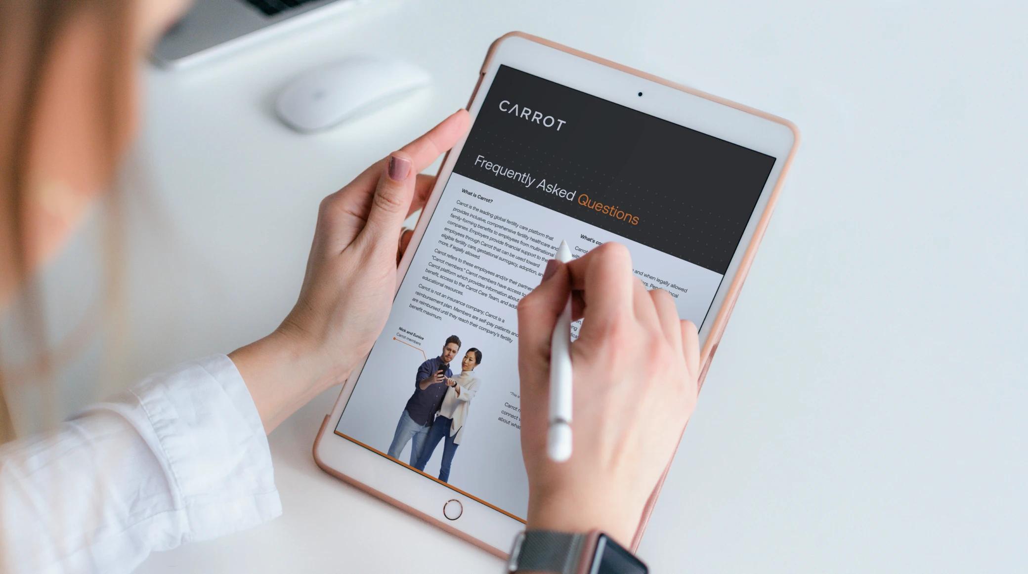
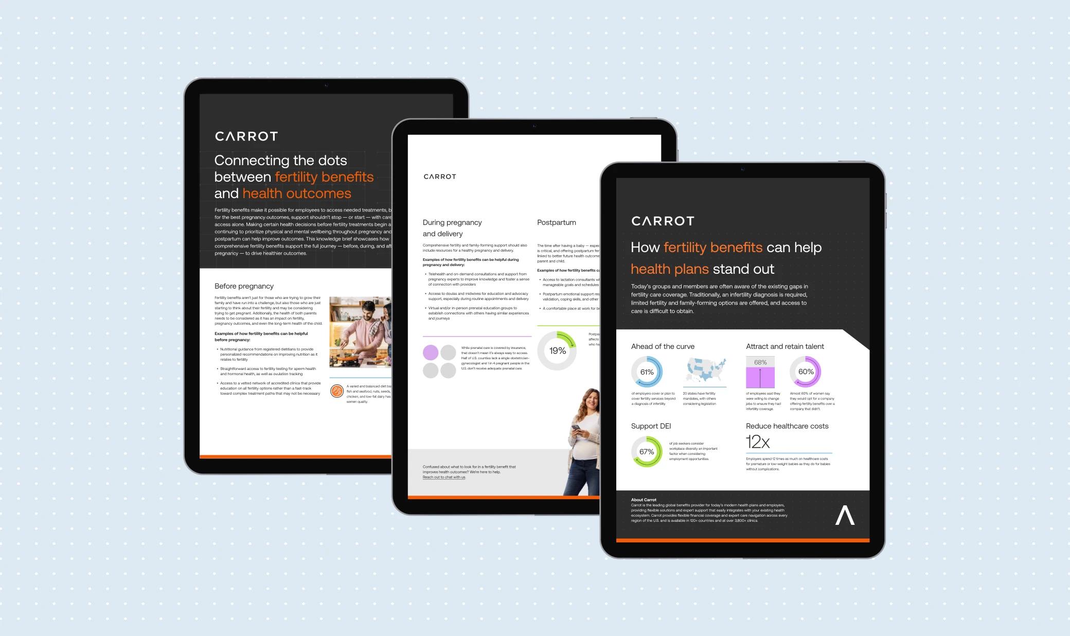
Carrot, a global group committed to providing fertility care for everyone, partnered with Sora Union to overhaul its branding, marketing collateral, and localization efforts. With a mission to break barriers in access to fertility care regardless of demographics, Carrot sought a comprehensive transformation to reflect its inclusive mission and global reach.
Client
Carrot
Deliverables
Branding, Marketing Collaterals & Localization
Year
2023

Design and Localization: Crafting a Cohesive Experience
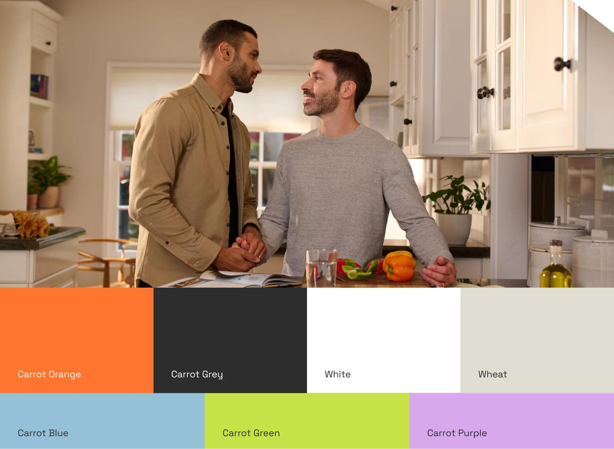
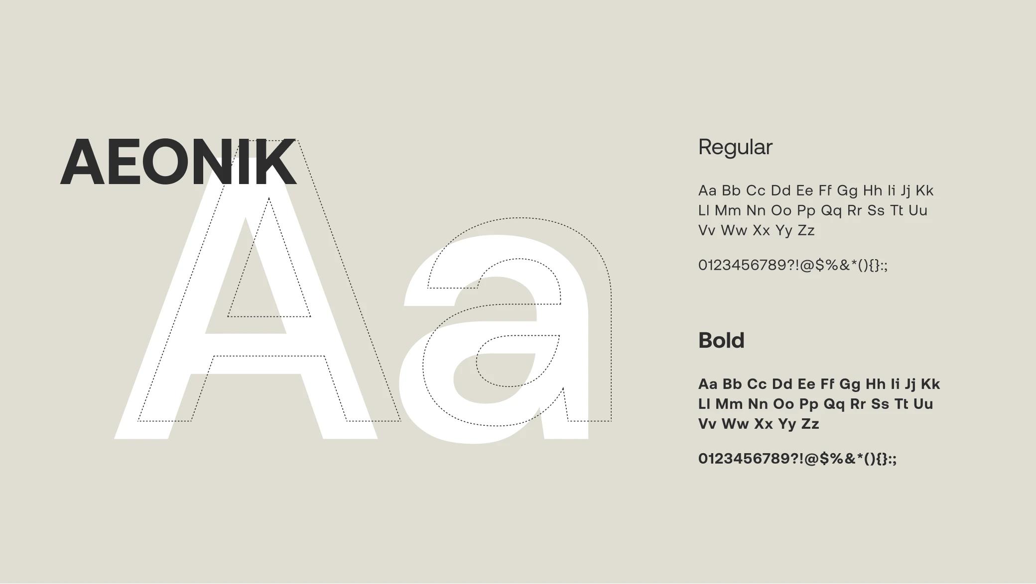
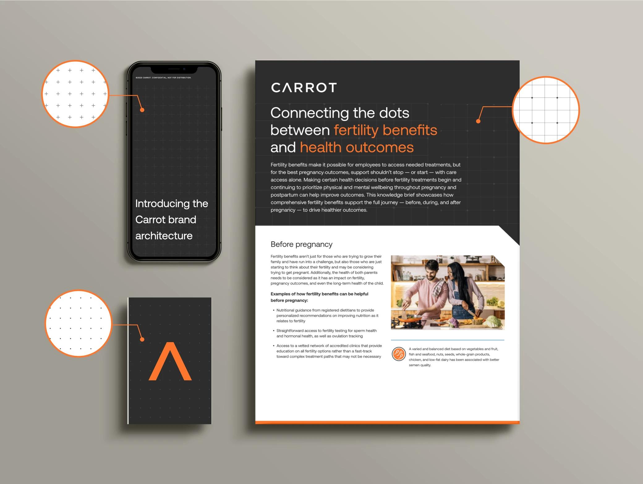
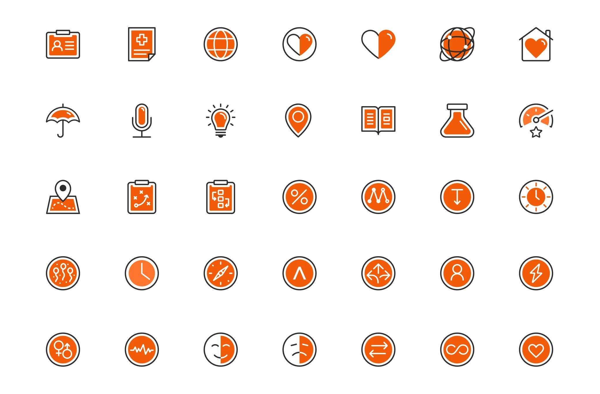
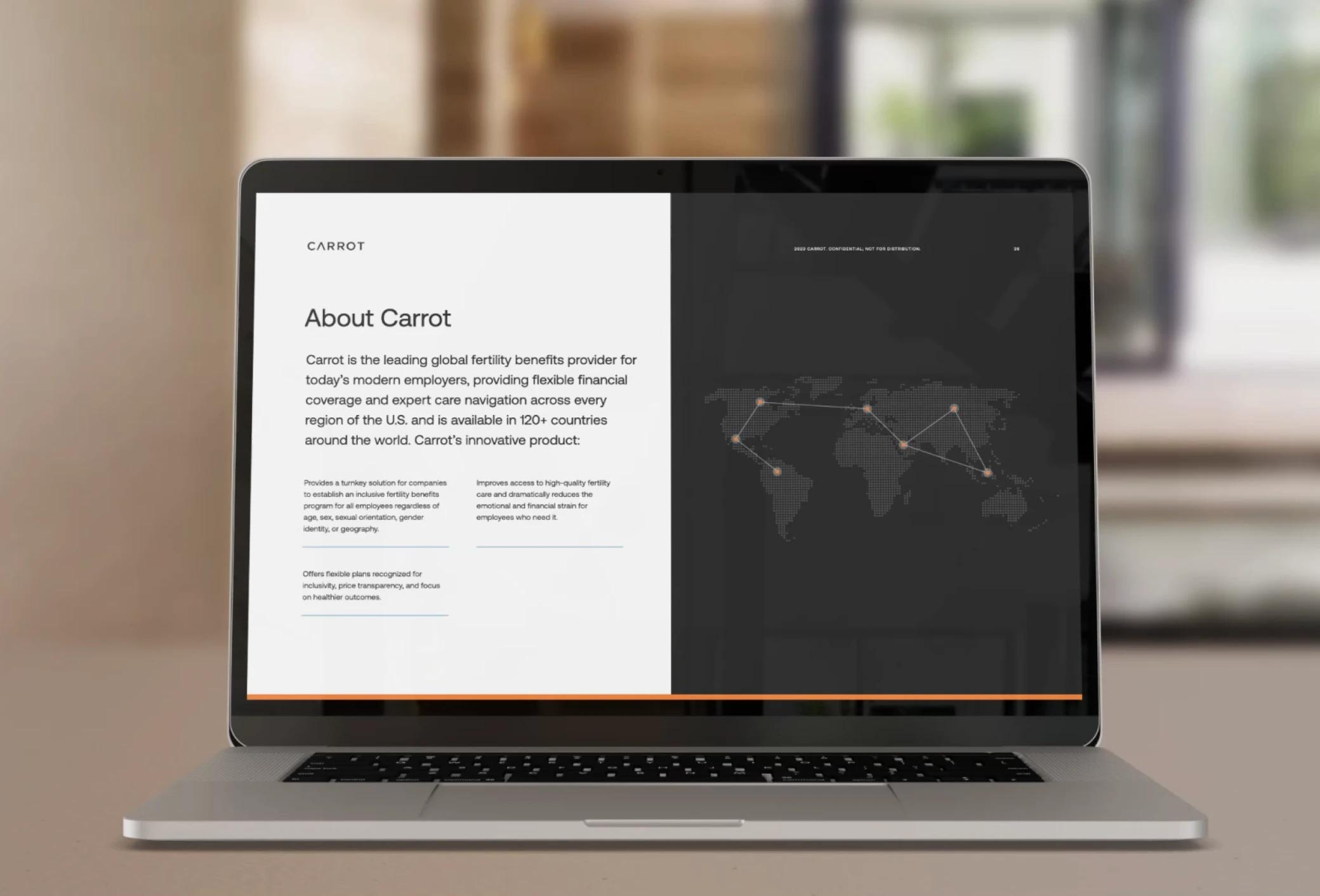
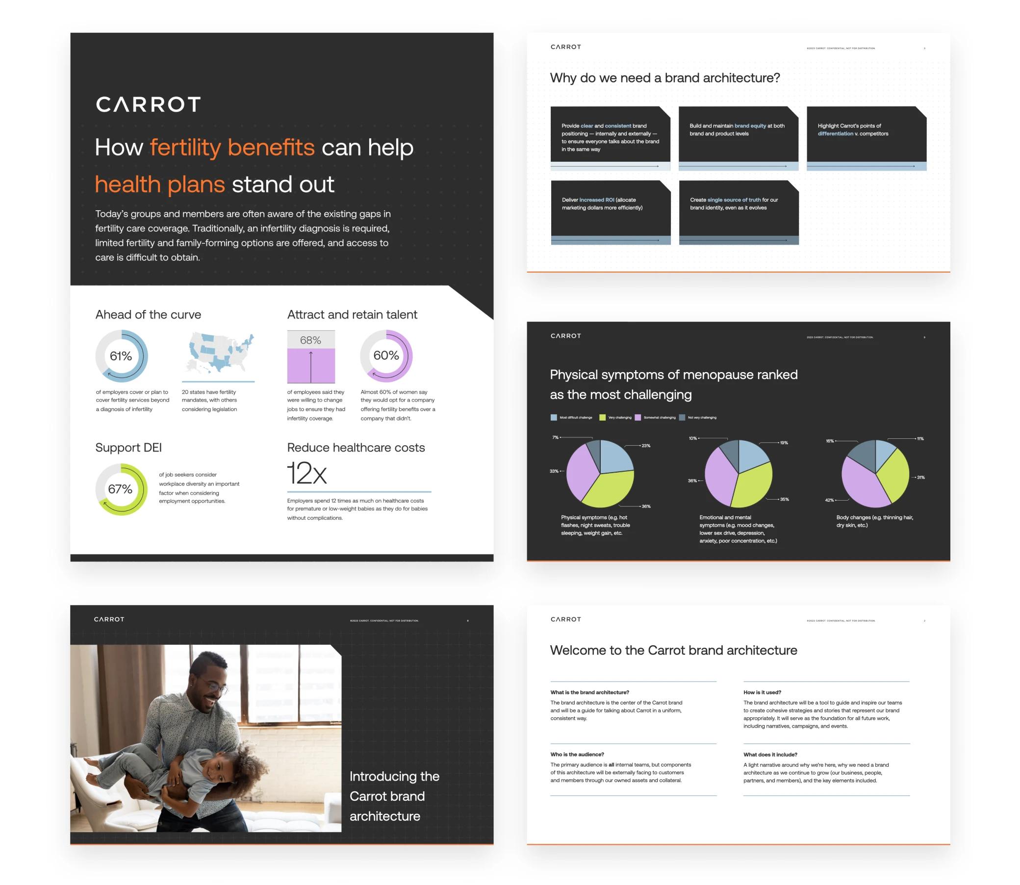
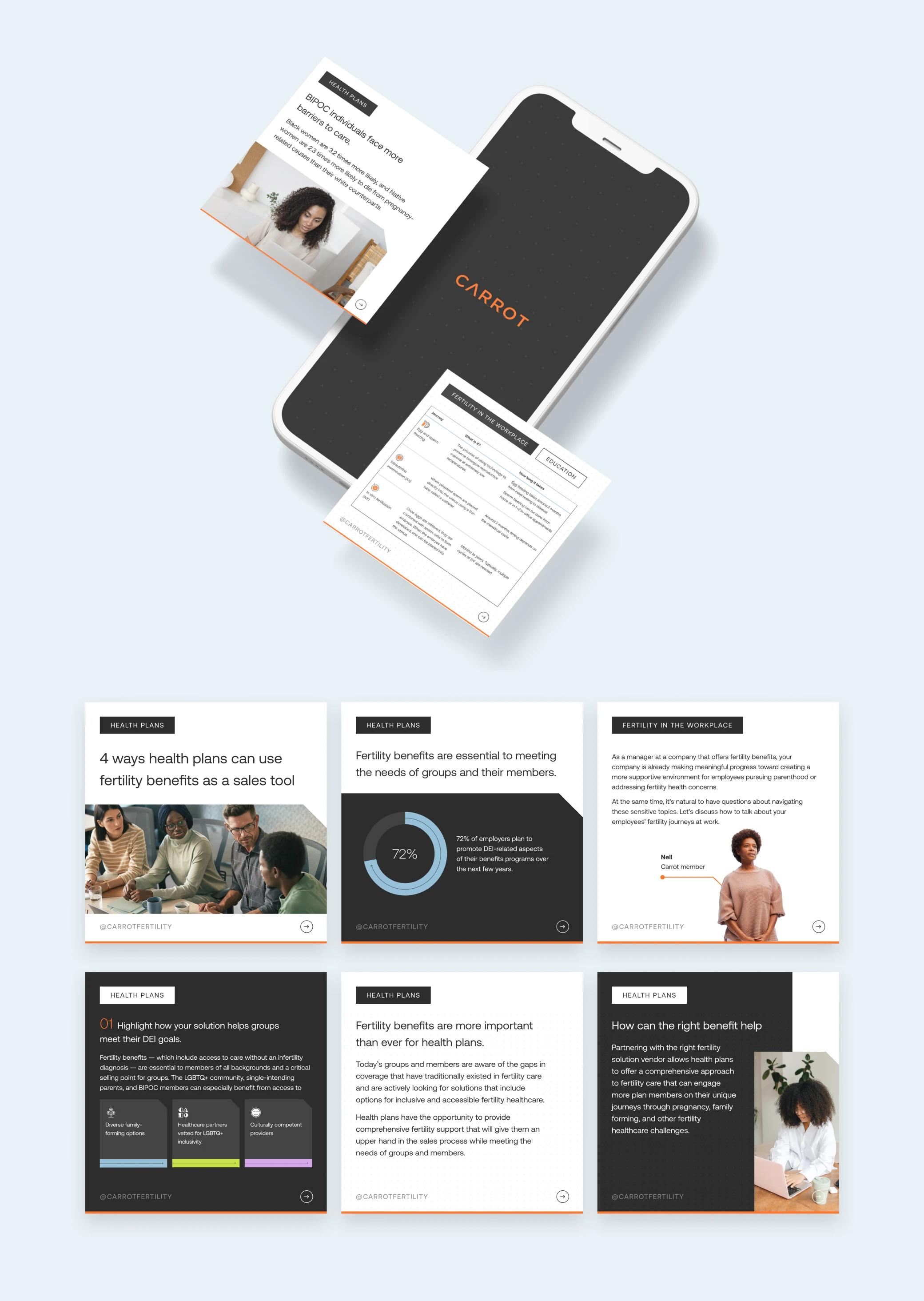
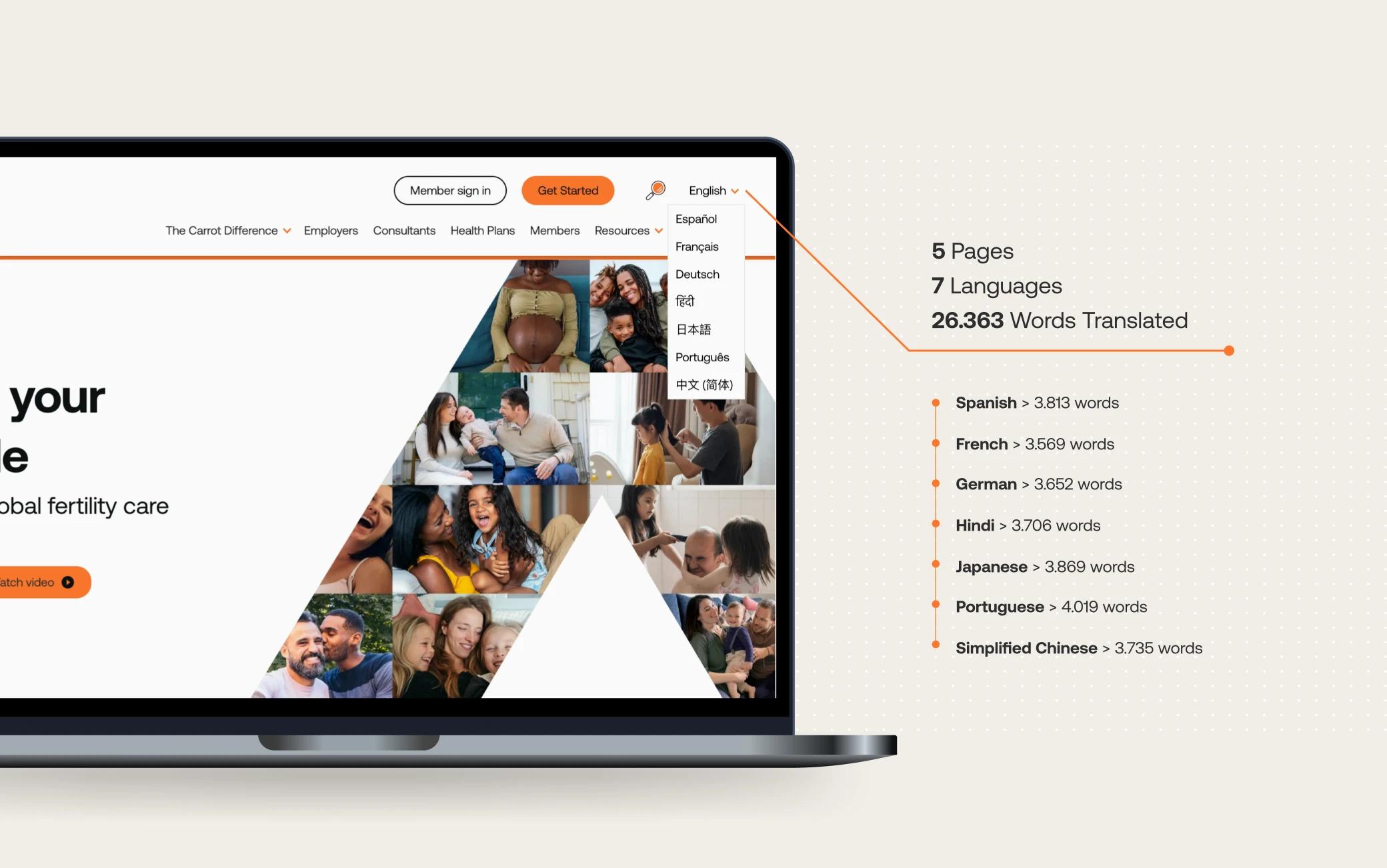
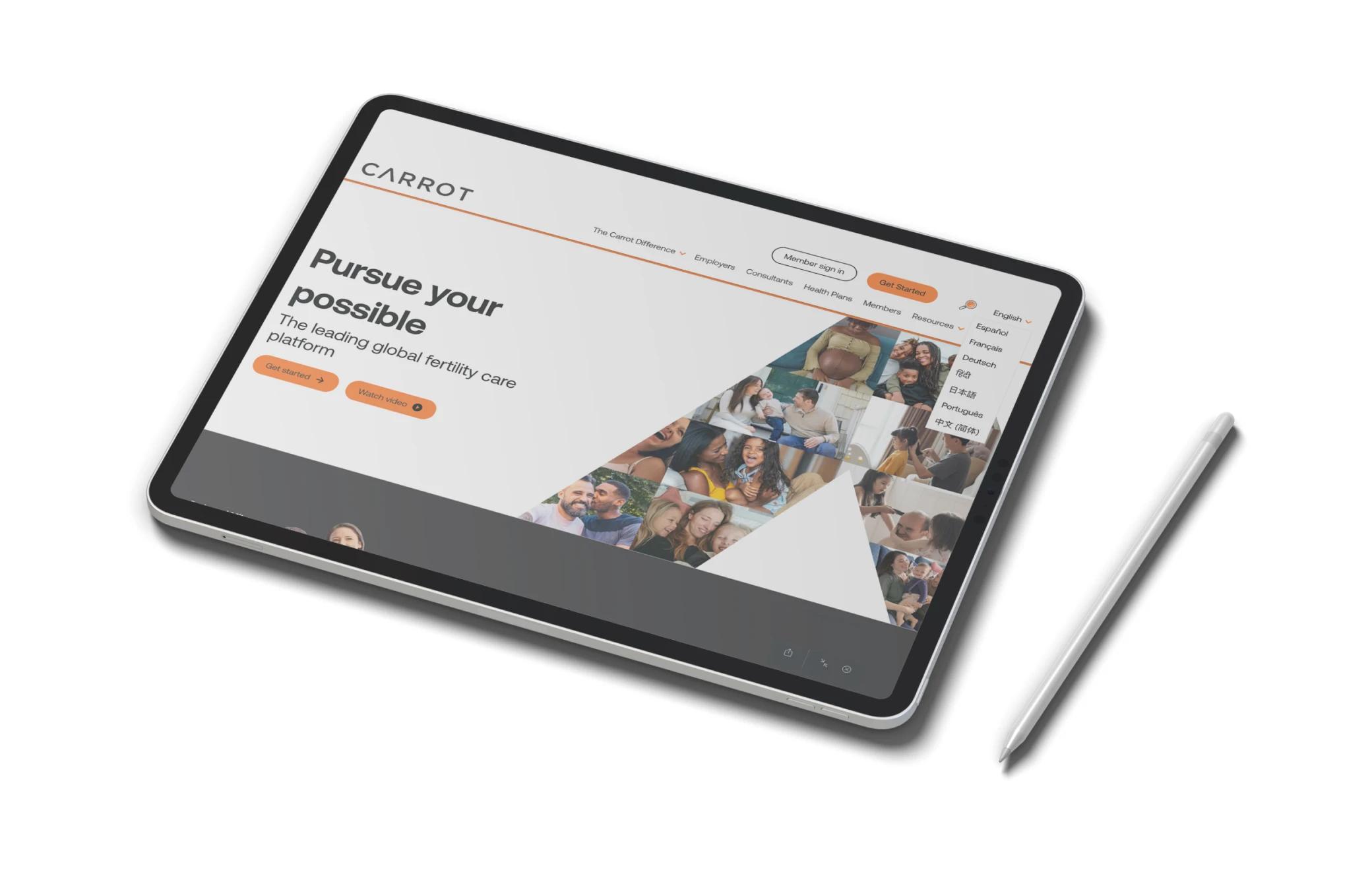
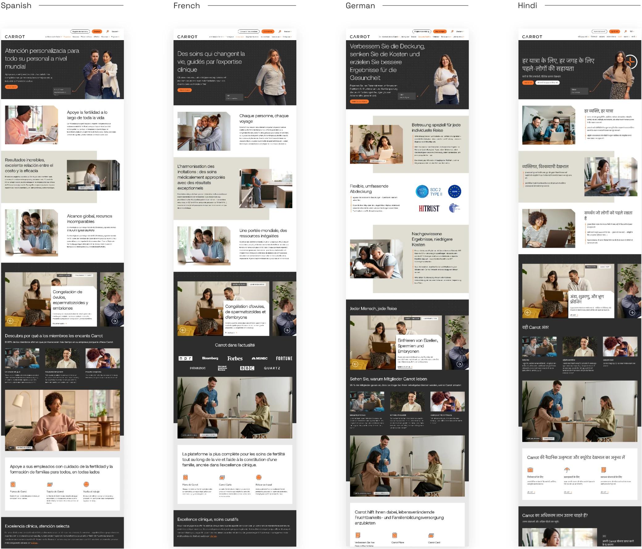
Sora Union undertook a comprehensive design and localization process, ensuring Carrot’s brand resonated across diverse cultural and linguistic contexts. From defining brand elements like colors, typography, and icon systems to developing guidelines for social media templates and data visualization, every detail was carefully crafted. Localization efforts extended across multiple languages, including German, French, Simplified Chinese, Portuguese, Hindi, Japanese, and Spanish, enhancing Carrot’s accessibility and global impact.
The Challenge
The Brand Identity

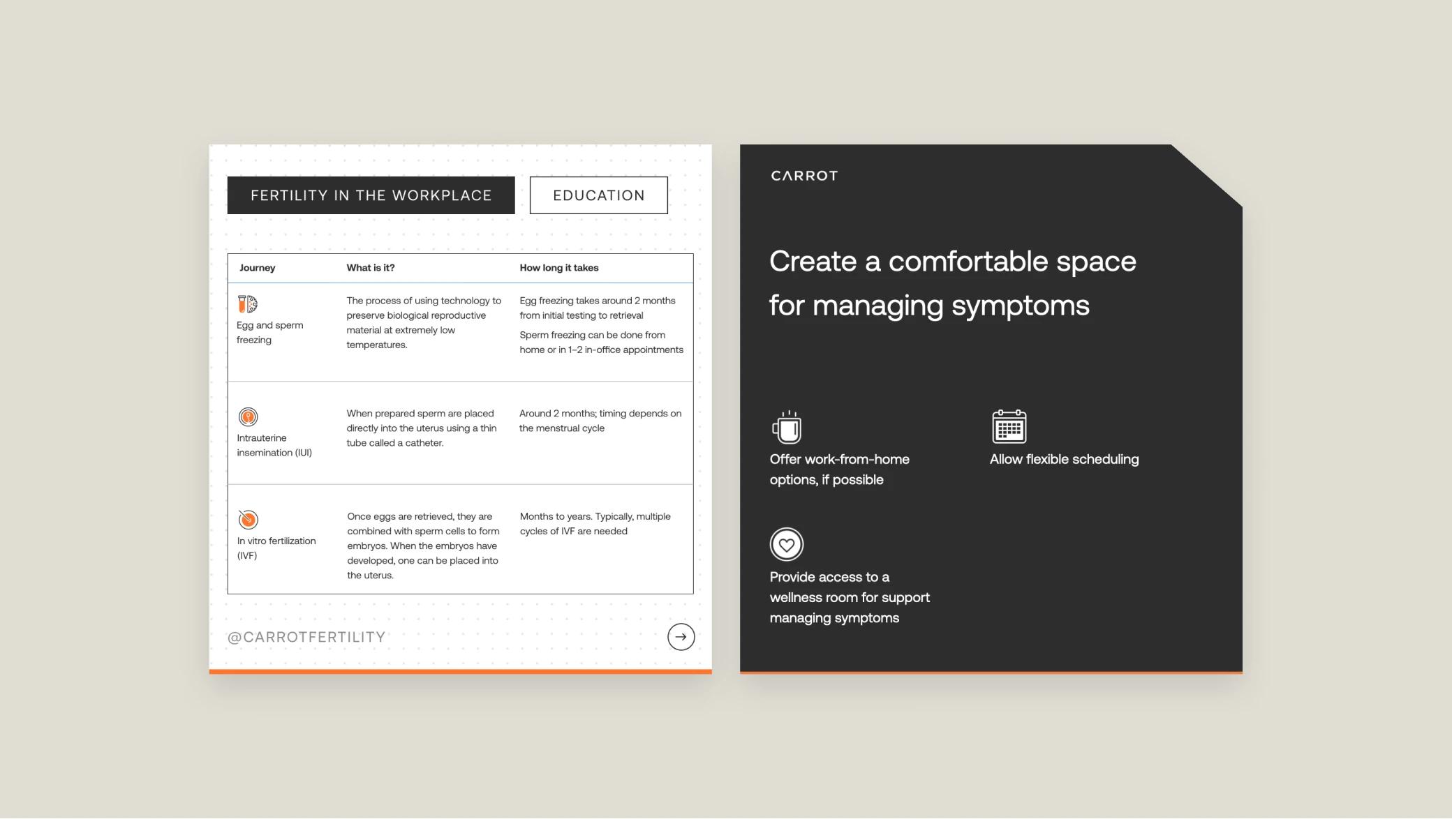
Marketing Collaterals
Social Media
Localization
The Result
By seamlessly executing Carrot’s brand guidelines and delivering over 18 social campaigns and various marketing collaterals, Sora Union played a crucial role in enhancing Carrot’s online presence. We provided translation services and contributed to
redesign efforts, ensuring consistency and quality throughout the project. This effort resulted in a cohesive and impactful brand identity, reinforcing Carrot’s commitment to accessible fertility care for all.
Key partner as we rebranded bringing incredible diversity and speed, and now we rely on them as our localization partner as we globalize our business.
 Tammy SunFounder and CEO
Carrot
More Life Sciences Projects

Blackbird Laboratories
Creating One Cohesive Brand System for Two Distinct Biotech Ventures
Read More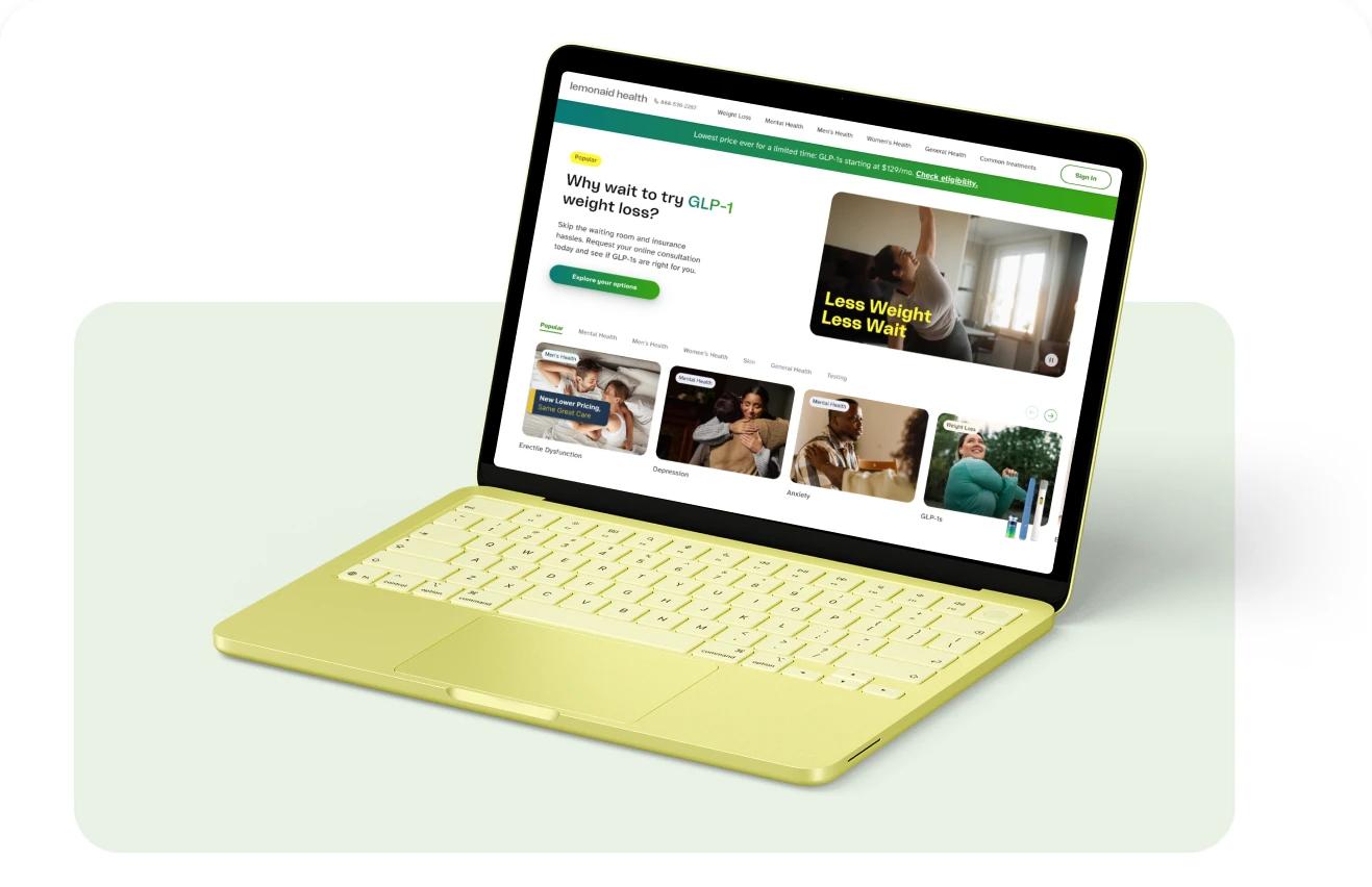
Lemonaid Health
Lemonaid Health’s UX/UI Audit & Research
Read More
Samsara Biocapital
Digital platform and product design for a clinical health technology company.
Read More