

Sector: Financial Services
How We Rebranded Crawford Investments
Crawford Investments had built a strong reputation over the years — but their brand no longer reflected who they had become. We were brought in to reimagine their visual identity from the ground up, creating a brand presence worthy of their track record.
Client
Crawford Investments
Deliverables
Brand Identity
Year
2026

Brand Identity
Elevating Crawford’s visual identity to match its true caliber
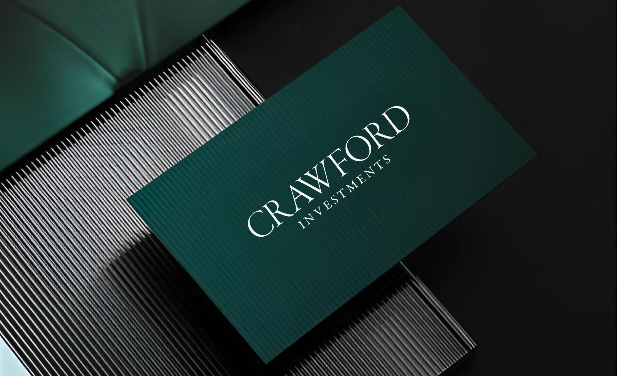
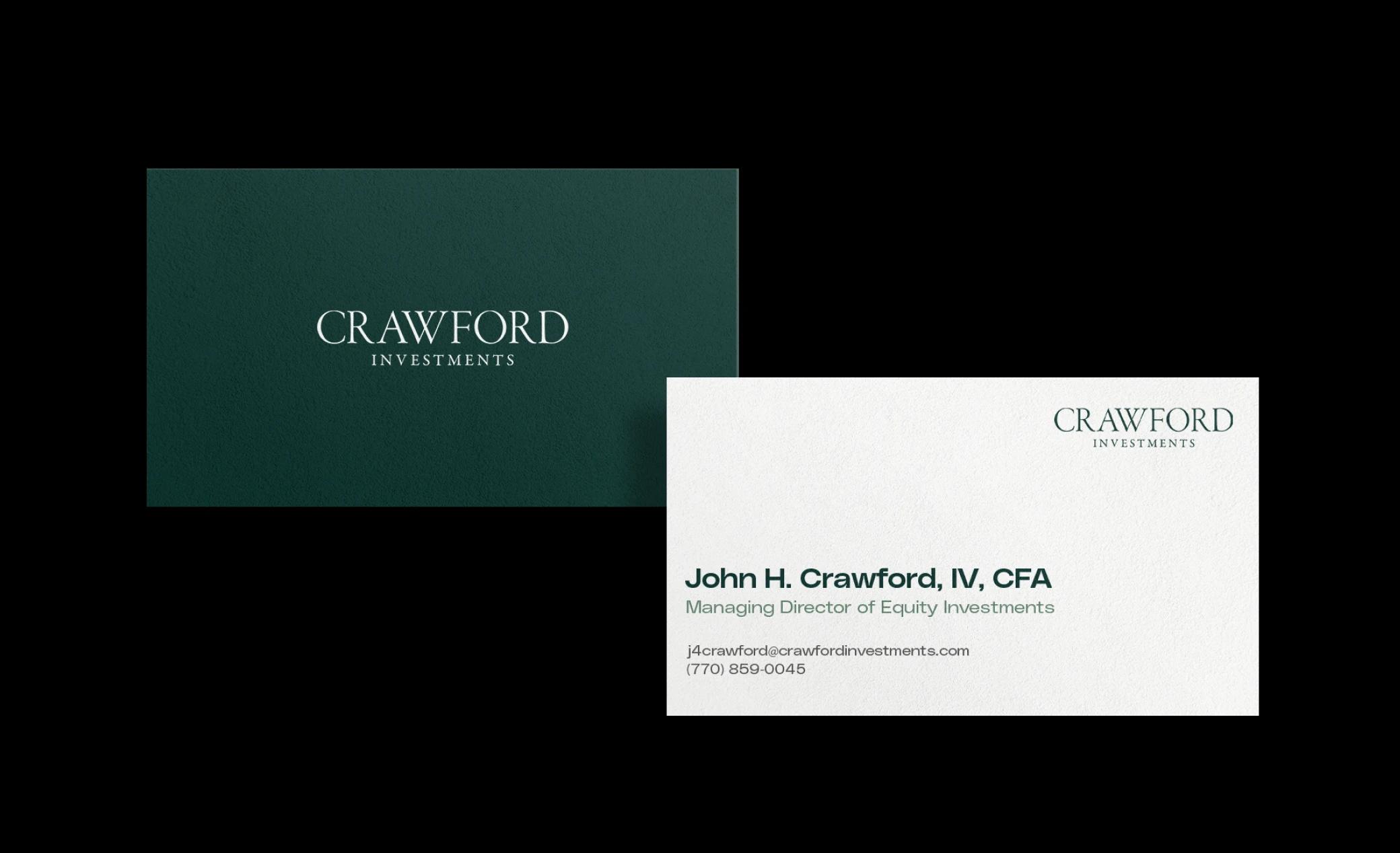
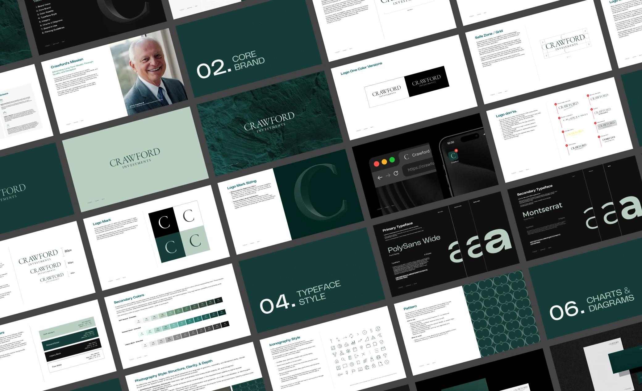
Crawford Investments had outgrown their existing brand. Their investment philosophy — patient, research-driven, built for the long run — wasn't coming through in their visual presence. We worked closely with the Crawford team to retire the old identity and replace it with something that truly reflects the firm they are today: website, logo, and all supporting collateral including business cards, signature blocks, and video backgrounds.
Explorations
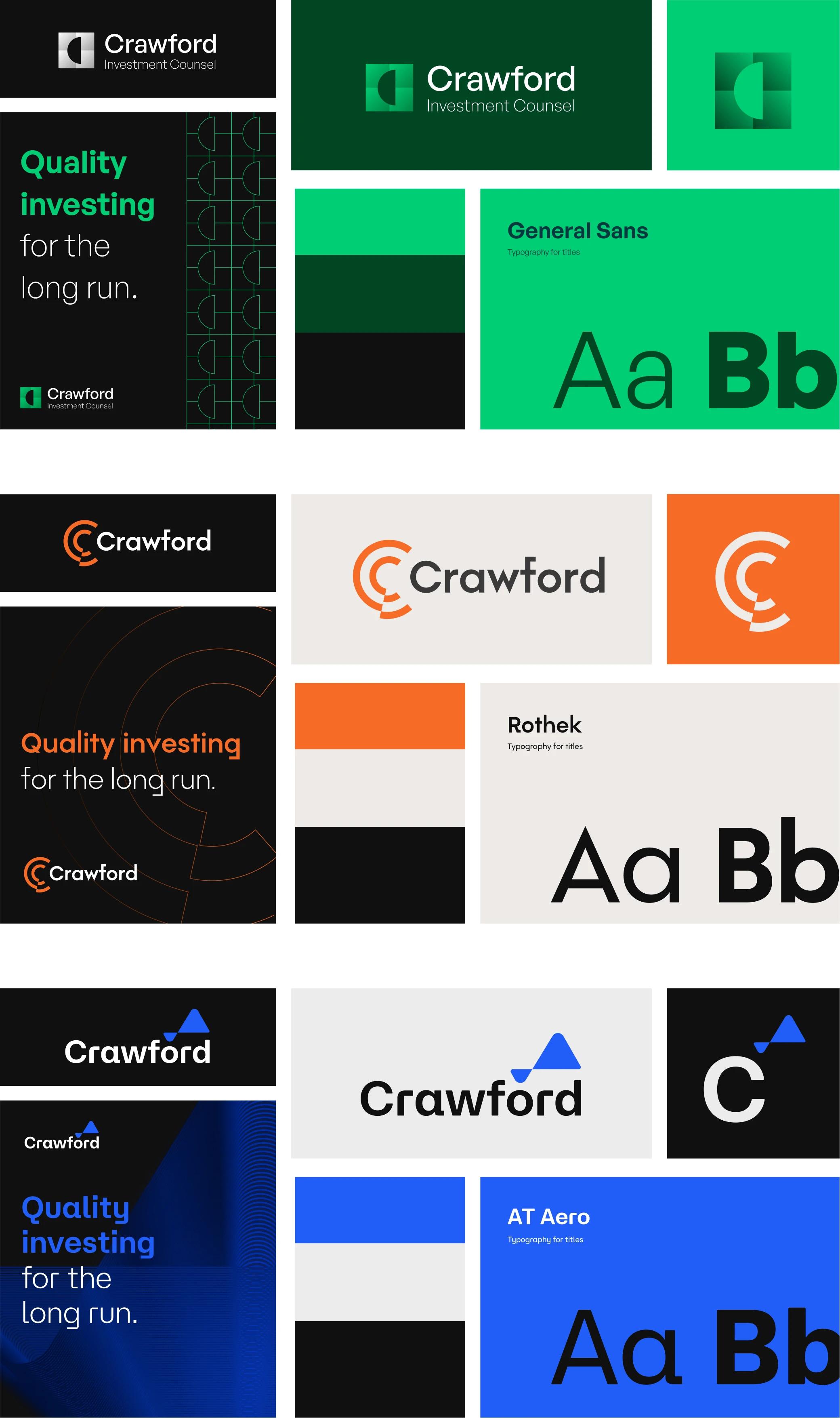
We narrowed our exploration to four directions, each taking a different approach to expressing Crawford's evolved identity. A typographic wordmark using the full Crawford name — authoritative, legible, and built to scale across applications A refined pairing of mark and typeface designed to signal institutional credibility A bold geometric approach exploring the "C" as a standalone brand symbol A hybrid direction combining form and typography to balance approachability with authority
All concepts were presented first in monochrome — stripping out color so the Crawford team could evaluate structure and form on their own terms. Color palettes and real-world mockups followed, grounding each direction in how it would actually live in the world.
The Winner
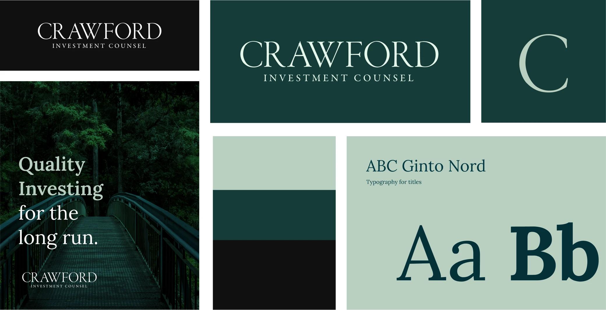
The Brand Identity


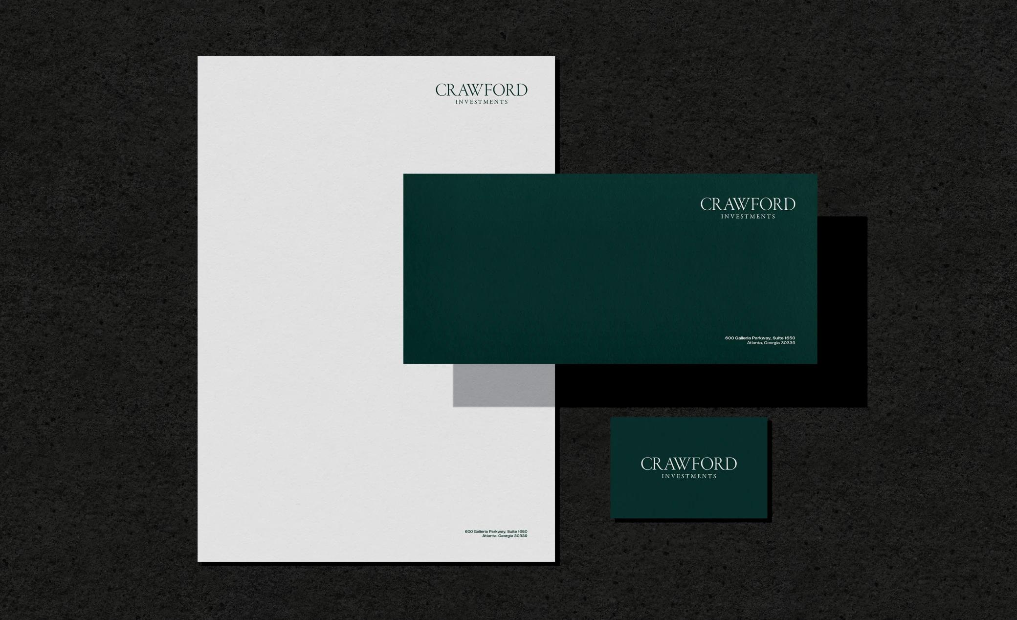
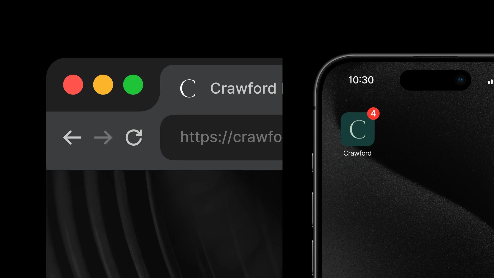

The Result
Website: https://www.crawfordinvestment.com/
More Financial Services Projects

A Custom Equity Research Platform for a Boutique Investment Firm
Read More
Andrea: An AI Platform Built for Financial Advisors
Read More
Arrowside
Comprehensive brand evolution with digital transformation and data visualization solutions.
Read More